Operational Aspects of the ITS System - Integrator 4.1
Introduction
The ITS systems are on-line systems,
i.e. users interact directly with
the database. Information is inserted and updated directly
into
the
database by authorized users via the browser interface: it may
be
viewed at any time by authorized users
on this interface.
Much of the paper flow and procedures which were essential in the past
to ensure control and correctness of batch processing, has now become
unnecessary. Now, information can often be captured at the point of
origin, and immediately verified on the screen by the person who
entered it into the system.
Therefore it is essential that every user is thoroughly familiar with
and
at ease with the use of his/her PC, which is the primary interface to
the information in the database.
The systems are menu-driven and user-friendly, i.e. after a user has
logged into the system he/she will navigate through the system by
selecting menu options and will be guided continuously by instructions
and help-messages on the screen.
In this document, important information
is provided concerning basic navigation and terminology, notational conventions used in the Online
User Manuals and the retrieval of information from the database.
Functionality
In this section the general functionality of the web-based version of
the ITS systems is discussed (i.e. the ITS Integrator back-office systems).
Browser
Access to the ITS systems can be done with any browser that has the
ability to run the Java plugin. The recommended browser is Internet
Explorer.
Windows Functionality
Windows functionality such as cut, copy and paste
etc. are available. The keyboard and the mouse (preferred) can be
used for
navigation when working in the menus and options.
System Settings
The system is made available to clients with standard settings.
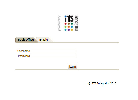
When logging onto the ITS Integrator
system, the following steps must be followed:
| Step
1 |
The user must have
access to a browser (e.g. Internet Explorer). |
| Step 2 |
Using the
browser, go to the IP address that is relevant to your institution.
This is
best set up as a link from the institution's local Intranet. |
| Step 3 |
The user will be
prompted to provide a user identification name and password.
|
The user ID and password are set up in User Access Definitions {USERS-5}: these are maintained
by the
institution. A user can be logged in more than once with the same user
ID. It is advisable to open another browser session for this.
For information on how to change passwords or unlock user accounts that
has been locked. Click Here
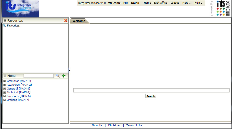
Once the user has logged on successfully, the Entry Screen will appear.
Integrator Entry Screen Click Here
The ITS Integrator Entry Screen is the gateway to the full ITS Integrator
Back-Office
System.
It consists of the following areas:
- Header: The Institution's Logo, the Integrator
environment and version, User who logged in, "Home - Back Office",
"Logout", "More" and "Help"
- Main Menu Bar: "Favourites" and "Menu"
- Welcome: "Search"
- Footer: "About Us", "Terms of Use" and "Disclaimer"
Menu
and Option Reference
The menu code and an option number in brackets identify any particular
screen in the system. For instance, {SREGAR-1} refers to
option 1 on the Academic Registration Menu of the Student
System. This option allows access to the Oracle screen for
normal registrations.
Some menu options provide access to more than one block of
information. If this is the case, a particular block is
indicated by a “b”, followed by a block number. For
example
{SREGB-1b2} would indicate the second block under menu option {SREGB-1}.
Some blocks extend over more than one
screen. If this is the case, a particular screen
(or “page”) is indicated by a
“p” followed by a page number. For example {SREGB-1b1p2}
would indicate the second screen of block {SREGB-1b1}.
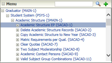
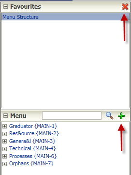
Drop-down
Menu Structure
There are three different
methods of obtaining a menu option in the ITS Integrator, adding the
menu/option to the "Favourites" area, using the tree structure and
search in the "Menu" area or using the search in the "Welcome" area.
However, if the user does not have access to a
particular menu option, it will not be seen in any of the areas. Regardless of access, the full menu structure view is
available in the Online
Help.
The most popular way of accessing menu options on the drop-down
structure is by using the mouse point-and-click feature. In
the
illustration below, Graduator is activated by point-and-click. This will only display a list of Graduator
main menus. The existence of expandable sub-menus is
indicated
by a small plus sign (+) before the option name.
Once program level is reached, options will be displayed with
different type of arrows: (<) or (>).
A "greater
than" sign (>) displayed after the
option name indicates Update Access: a "less than" sign
(<)
indicates Select-only Access and a "hash" (#) denotes no access. (Note: The user will only see this if they
search for a menu and not when they use the tree structure).
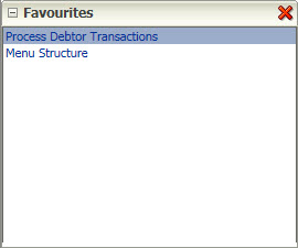
Favourites
Each user of the ITS Integrator system can
set up an
individual list of favourite menu options. These options are accessible
via the Favourites
menu in the Main Menu Bar and there is no limit to the number of options that can be linked to Favourites.
To Add an
option to Favourites:
- Open the option you want to add, and then from the
Main Menu Bar (on the left of the "Welcome" area) click on the green
plus (+) sign. Note: the Add option, will only be available if the user
is trying to
create an entry from the option that is not already on
the user's "Favourites"
list.
To Remove
an option from Favourites:
- On the
Main Menu Bar (on the left of the "Welcome" area), select the option
that you want to remove and click on the red (X) sign. A pop-up will
appear, prompting the user to "Confirm Menu Favourite Remova".
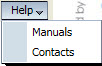
ITS Integrator features a Help system, available
at
any point from the Header Bar. Apart from offering On-line Manuals,
the
Help menu
option also offers a list of "Contacts" that the institution can link.
Environment Identification
The environment and version of the Integrator session is displayed in the Header area of the home screen.
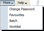
The Work List can be accessed via the "More" button in the Header area (which opens the Update Routing Request
screen {GROU-3}) and will allow the user to see the status
and the number of jobs requested to be done by himself / herself. Jobs
listed on the Work List
are routing
requests without an outcome.
The
ITS Integrator allows for running of reports online or in
immediate / deferred batch. Online run reports run immediately: the
user’s
session is freed to enable continuation with other work only after the
job
has completed. When
one of two Batch
options is chosen, the user's session is freed
immediately regardless of the requested job status.The difference
between
the two Batch options is that: when the Immediate option is
chosen the job will run immediately in the background: whilst the
Deferred option, the request will be executed at a later stage.
Requesting a batch
job will result
in new record appearing in the {Batch-20} which can be accessed via the "More" button in the Header area.
Applications -
Internal Navigation, General Concepts and Notational
Conventions
Basic
Terminology
Three terms are used
regularly throughout Integrator User Manuals,
and users should be familiar with their meaning.
These terms
are “FIELD”, “RECORD” "BLOCK" and
“PANEL BOX”.
- “FIELD” is a
place where a single piece of information is entered into the database,
e.g. the surname of a person.
- Navigation key: <enter>
key,
<tab> key and mouse .
- “RECORD” is a
group of fields that belong together, and which are usually entered
together,
for example all the personal details of an individual. If a
record does not contain many fields, for example simple code
structures, up to seventeen records may be displayed simultaneously on
one screen. Sometimes, however, a record contains so many
fields that only one record can be shown on an input screen, or it may
stretch across more than one screen, e.g. the biographical record of a
person.
- Navigation key: "First", "Prev", "Next" and "Last" buttons for ADF and <down
arrow> key for Forms
- “PANEL BOX” is a
portion of a screen where logical fields are grouped together to facilitate quicker capturing of a record. Some
screens contain several panel boxes and panel boxes only apply to ADF taskflow screens.
- Navigation key: <Tab> or click on a field in the next panel box with your mouse
- “BLOCK” is a
portion of a screen where identical records are entered, for example,
the personal details of a student will be entered into one block and
the subjects for which he is registered into another. Some
screens contain several blocks and others contain one block
only. Some blocks are so large that they extend over several
screens. Block only apply to Forms screens
- Navigation key : <shift
+ page down>.
Notational Conventions
It is essential that every
user of the ITS systems be familiar with the
conventions used to describe data fields, screen locations, etc.
Data Fields
When a particular data
field on one of the screens is discussed in
any manual, the following convention is used:
The type of field is indicated as either
• numeric (N) or
• alpha-numeric (A),
• followed by the length of the
field.
Example:
- The student number field will be (N7), indicating that it
consists of a
seven-digit number.
- The surname field will be (A30), indicating
that it is a 30-character alpha-numeric
field.
Where decimal numbers are
allowed, this
is indicated by a full stop in the number and the length of the decimal
indicated after the full stop.
Example : (N15.2), which allows
numbers up to 999999999999999.99 to be
entered. Once an application (option) has
been opened, the user can navigate
within
the application in the following ways:
- To navigate between fields on a record press <Tab>
or <Enter> or
click on another field with your mouse; take note that
pressing the <Enter>
key in a multi-line field creates a new line within the field. Press <Tab>
to exit the multi-line fields.
- To navigate between records use the "First", "Prev", "Next" and "Last" buttons.
- To navigate between panel boxes use the <Tab> or click on a field in the next panel box with your mouse.
Date
Format
The standard date format
used in all input screens is
“DD-MON-YYYY”, for example
“12-MAY-2003”. The month is always
entered as the first three letters of the English name of the
month.
In those rare instances where a non-standard date format is used, this
will be clearly indicated.
Letter
Case
In some data fields in the
systems, lower case alphabetic characters
are automatically converted to upper case. In other cases,
for instance with surnames, first names and titles, however, the
systems will accept
lower case characters as well. This allows class lists and
personnel lists to be printed in both upper and lower case
characters. It is essential, however, that such information
should be entered in a consistent manner to ensure a consistent look on
reports. A decision in this regard should be made before
take-on of biographical information commences.
Functions within an application can be performed
by using the
icons on the toolbar
.
Help
Facilities
Help per Field (Only available for Forms options)
A single line of detail on
each field in the systems is available to
the user by simply pressing the 'HELP' (?) key when the
cursor is at the particular field in the input screen. The
message will appear at the bottom of the screen:it will provide more
detail on the particular field and its permissible values.
The length of the field and its type, i.e. numeric (N) or alpha-numeric
(A), will also appear in the format (eg: N30).
Shortcut key : 'Ctrl + H'
By pressing the 'HELP' key
a second time, the user will be provided with a full screen of
technical detail relating to the
field. The user can easily see whether the field is mandatory
(i.e. must be entered), etc. <CLICK> on
“OK” to return to the
menu.
Tool tip (Only available for Forms options)
When the mouse is moved
over the field, a small window is displayed
below the field with a condensed help for the field.
This tip will also indicate to the user the length of the field and its
type, i.e. numeric (N) or alpha-numeric (A), will also appear in the
format e.g.: N30.
Shortcut key : move mouse over field
Fields in ADF Taskflows
The type of field can be seen by the colour of
the prompt. The following provides a guideline to
understanding the fields that are seen. Refer to the screen
print
below for example fields. Note the colours are dependent on the ADF
skin that is used and the coulours below are from the default ADF skin:
Fields in Forms
The type of field can be seen by the colour of
the prompt. The following provides a guideline to
understanding the fields that are seen. Refer to the screen
print
below for example fields:
List of
Values (LOV)
The <LIST OF VALUES (LOV)> command can be used to display
the allowed values for a field. This facility is usually
available on fields where there is a fixed list of codes as defined by
the institution, which are allowable values in the field. The
user would not normally know all the allowable values and can use the
<LOV> to select the required value.
With the Forms options, when the <LIST> key is
pressed, a pop-up window appears on the screen, with a heading
explaining which information is displayed below. The cursor
will be positioned on the first of the values, and can be moved with
the <NEXT RECORD>, <PREVIOUS RECORD>,
<SCROLL DOWN> and <SCROLL UP>
commands to find the required code. When the user presses
<ENTER>, the system will insert this value into the data
field on the Oracle screen and return to the screen.
The above method is fine for short lists
of values, but can be time consuming and frustrating if the list is
very long, e.g. a list of departmental codes. To assist the
user in such cases, the <FIND> facility in the list can
be used to search according to codes or description displayed in the
list.
Shortcut key : <CTRL +
L) or <CLICK> on grey button next to
field.
With the ADF options, when the <LIST> key is pressed, a "Search
and Select" pop-up window appears on the screen. The user can fill in
any of the fields to search for a specific entry or can just click on
the "Search" button to view all the entries for that list of values
which they can select from by clicking on the entry and clicking on the
"OK" button. The "Search and Select" window also has an "Advanced"
button to do advanced searches.
Default Values (Forms only)
The default value facility enables the user to save a query or input
criteria on a form, to be used at a later stadium. Enter the query and
then click with then right click on the canvas, thus the background
part of the application, to get a pop-up menu for saving of retrieving
the information. Save the new criteria or retrieve the
criteria.
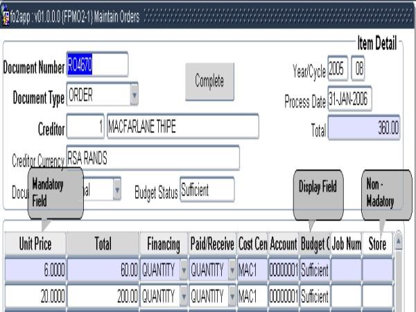
Buttons (Forms)
The ITS system makes use of the following buttons:
| Type of Button |
Description of what it Looks
like |
Where
it is Found |
| Radio Buttons |
Used where one of two options
have to be selected.
 |
If
the field selection has one of two options e.g. Male or Female as in
the example on the left, where the field "Show" allows a value Yes or
No.
|
| Combo Box |
A
square button with a down arrow in the button is shown at the end of a
combo-box field. The user must 'tab' past
a combo box, or click on the next field with the mouse, or 'enter'.
 |
A
fixed list of values as predefined, e.g. the field "Indicator for
Competence" in the Block example below. |
| List
of Values |
A square with '3' dots
inside appears at the end of the field once the cursor is in that
field.

The icon (Ellipses.gif) which appears in the right-hand side of a field
when there is an ‘LOV” present, does not appear
once the
user has activated “Enter Query”. However, the
“LOV” still works from the menus or by using the
accelerator key “ALT-L”. We have approached Oracle
about
this problem and their answer is as follows:
QUESTION
========
The LOV Button can be set to visible by following the indication in
Note 267018.1 How to enable the LOV indicator (Button) in Web Deployed
Forms?
namely by setting
app.ui.lovButtons=true
in the file ...\forms\java\oracle\forms\registry\Registry.dat
This shows the LOV button when the block is not in ENTER-QUERY mode.
But is it possible to also show it also when in ENTER-QUERY mode ? |
To
select from the list of values. The
user can click on this square to obtain the list of values or press
Ctrl+L when the cursor is in the field. These are values as defined in
the code structures, e.g. Output Format above.
ANSWER
======
This is not possible, but an enhancement request has been raised and
not yet been decided upon.
:
The Enhancement Request can be consulted on Metalink (as with bugs)
with the following "bug" number:
2179613 EXTEND APP.UI.LOVBUTTONS TO ALLOW DISPLAY OF LOV IN ENTER-QUERY
MODE |
| Content menu Pop-ups |
A curved arrow appears when
holding the mouse over the field.

|
On
data sheet layouts and on the main entry screen, under 'Charts' , if
you move your mouse over the 'options' .
|
See for yourself in: {PBOP-1}
- The Personal Number is a List of Values
- Marital Status is a Drop down Combo Box
- Gender is a Radio Button
- Student number on {SNAPPA-11} is a pop-up.
Buttons (ADF)
The ITS system makes use of the following buttons:
| Type of Button |
Description of what it Looks
like |
Where
it is Found |
| Radio Buttons |
Used where one of two options
have to be selected.
|
If
the field selection has one of two options e.g. Male or Female as in
the example on the left, where the field "Show" allows a value Yes or
No.
|
| Combo Box |
A
square button with a down arrow in the button is shown at the end of a
combo-box field. The user must 'tab' past
a combo box, or click on the next field with the mouse, or 'enter'.
|
A
fixed list of values as predefined, e.g. the field "Indicator for
Competence" in the Block example below. |
| List
of Values |
A magnifying glass appears at the end of the field.

|
To
select from the list of values, the
user can click on this icon. These are values as defined in
the code structures. |
Check Box
|
A white box that is either blank or can have a tick in it.

|
In options like Maintain No Show Indicators in AR and SD.
|
Pages (Forms only)
Multiple pages per application can be seen as tabs at the top of the
screen. Additional pages can be reached by using the arrow
button on the right-hand side of the bar.
Blocks (Forms only)
A block refers to a collection of relevant data that is stored in a
database table and is presented in the application for the
user to view or change.
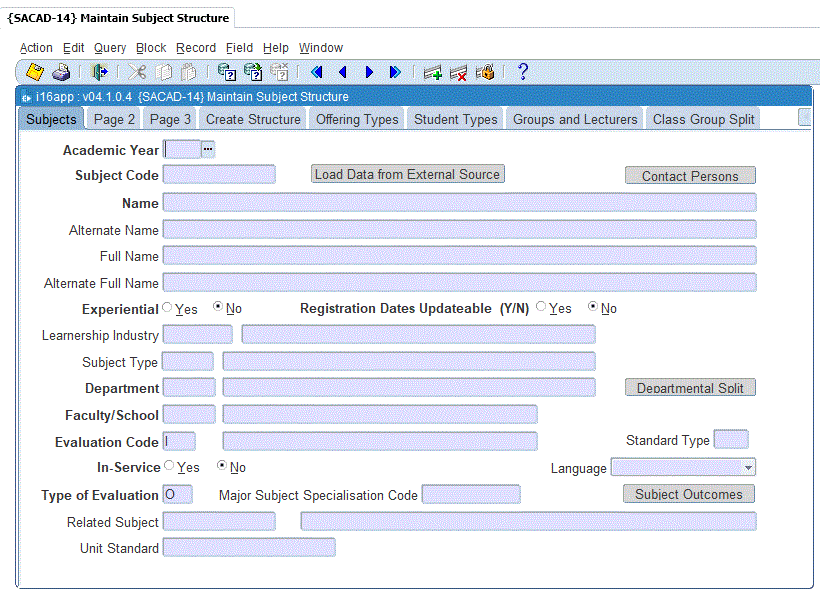
Each block can be seen as a separate tab at the top of the
page with the relevant heading. If the block continues over
one page, the next tab page will be labeled as 'Page 2': this indicates
that there is
additional information that needs to be completed for that
block.
The 'Next Block' icon  will take the user to the next block or by pressing the
'Shift+PageDown' shortcut key combination or
just by clicking on the tab itself. The user can also view a
list of the blocks applicable to the present option by pressing
'F2'. The user can then move directly to the
relevant block from this facility.
will take the user to the next block or by pressing the
'Shift+PageDown' shortcut key combination or
just by clicking on the tab itself. The user can also view a
list of the blocks applicable to the present option by pressing
'F2'. The user can then move directly to the
relevant block from this facility.
In the example below the first block is labelled "Subjects".
The block continues onto "Page 2", and the second block is
labelled "Create Structure".
Mouse Navigation
The user can move within the application by using the mouse; the
'TAB' key or
the 'ENTER' key.
Entering Information into the Database
Information is entered into the database for three reasons:
- a new record must be created
(“inserted”),
- an existing record must be changed
(“updated”), or
- an existing record must be removed
entirely (“deleted”).
Creating a New Record
When using the appropriate menu option the user will be presented with
a blank
screen containing the fields into which information must be inserted:
each field is preceded by a short description of its
contents. A “cursor” (i.e. a blinking
line or oblong marker) will be positioned at the first field into which
information may be entered.
The appropriate information is now typed into the first field:
<ENTER>, the mouse or <TAB> is used to
position the cursor in the next field, which is then
completed. This process continues until all fields for this
record have been completed, this could cover more than one screen
depending on the record length.
Information on the screen, as above, has not yet been written into the
database, but exists merely in the memory of the computer. To
enter the record into the database, the <COMMIT> button (Forms) or <Save> button (ADF) must
be pressed, after which the message:
“Working....” will be displayed at the
bottom of the screen for a short while: this is followed by the message
“Transaction complete: N records applied and
saved”, where N is the number of records that were actually
written away into the database. Note: This message will only be displayed on forms programs.
The user is not forced to commit after each record, but if a record
covers an entire screen or more, it is recommended that the information
be written away to the database before the next record is created.
Throughout the process of data entry, the system will check wherever
possible that only valid information is entered. For example, if a
subject code
is entered that has not yet been defined in the database, the system
will provide an error message to this effect and will not allow this
code to be used. In this instance the subject must first be
defined in the appropriate part of the system before the code may be
used. The system will not allow the creation of duplicate
records and will provide messages such as: “Row has already
been
inserted”, “Duplicate value in
index” or “Unique key constraint
violated” if it detects such an error.
Creating
Records that are
very
Similar
It often happens that several records have to be created which are
similar in most respects. Typical examples are timetable
records where the timetable information for a particular lecturer is
being entered for an entire week, subject records for different
offering types, etc.
When this situation arises, the following procedure should be used for forms:
1. Create the first record
2. Create a new, blank record using the
<INSERT RECORD> command
3. Use the <DUPLICATE
RECORD> command to copy the previous record into the blank record
4. Make the desired changes
5. Repeat steps 2 to 4 as often as
necessary: dont forget to <COMMIT> at regular
intervals!
The following procedure should be used for ADF taskflows:
1. Create the first record
2. Create a new, blank record
3. Use the <DUPLICATE
RECORD> command to copy the previous record into the blank record
4. Make the desired changes
5. Repeat steps 2 to 4 as often as
necessary: don't forget to <Save> at regular
intervals!
Updating an Existing Record
Before an existing record can be changed, the record must first be
retrieved from the database by “Executing a Specific
Query”. For more information on
this refer to the section on “Retrieving information from the
database” in this manual.
Once the record is on screen, the necessary changes are made in the
applicable fields and the record is <COMMIT>ted or <Save>d.
Deleting a Record
The <DELETE RECORD> command (Forms) and <Delete> button in ADF is used for this purpose,
followed by <COMMIT> or <Save>.
The system will often not allow a record to be deleted unless certain
preconditions have been met. An example of this can be found
in the Space Inventory system where a room cannot be deleted if assets
are still allocated to the room.
Retrieving Information from the
Database
Apart from the “traditional” way of retrieving
information from the database, i.e. by requesting, every user of the
ITS
systems can execute queries from his / her terminal that will allow
many
ad hoc queries to be answered promptly and without requiring the
involvement of the IT Department or, in fact, the production of printed
reports.
Some examples of common queries are presented below. Queries
of a more complex nature can also be dealt with - consult the Oracle
manuals or your technical personnel for guidance in this respect.
The General Query
- To retrieve all records in a
particular block, press the <EXECUTE QUERY>
key (forms) or <Search> for ADF. The cursor will be positioned at the first record and
the rest may be reached by using the <NEXT RECORD> key (Forms) or <First>, <Prev>, <Next> key.
- To count the number of records
in the block, use the <COUNT QUERY HITS>
command (only available for forms). If you then use the <EXECUTE QUERY>
key, it will retrieve the records that were counted with the previous
action.
The Specific Query (ADF)
The "Search Dialog" pop-up in the ADF options allow the user to perform
a specific query via the "Advanced" button. This functionality allow
the user to perform all the queries that were available in forms (See
below).
The Specific Query (Forms)
In most cases the need is for more specific information retrieval, in
which case the following procedure is followed:
• press the <ENTER
QUERY> key.
• move the cursor to the field
to be queried.
• type the desired value in the
applicable field, e.g. student number.
• move on to any other fields
that may also be required for the query, and type in the desired values.
• when the complete query has
been entered, use <COUNT QUERY HITS> if a record count is
desired.
• otherwise press the
<EXECUTE
QUERY> key to retrieve all the entries in this block that
conform to these criteria.
The “%”
(Percentage) Query (Forms)
To find all subjects that include the characters
“ACCOUNT”:
• Press <ENTER
QUERY>
• Move the cursor to the subject
field
• Type in %ACCOUNT%
• Press <EXECUTE
QUERY>.
The first record will be displayed and the rest can be viewed one
after another using <NEXT RECORD>.
The % sign acts as a so-called
“wildcard”. The specification %BERG will
select only those surnames ending in “BERG”,
whereas BERG% will select all the surnames starting with
“BERG”.
Query Using Variables (Forms)
All students with student numbers between 20021000 and
20022000,
can be selected as follows:
- Press <ENTER QUERY>
- Move the cursor to the
“student number” field
- Type & in
the field
- Press or click
<EXECUTE QUERY>, (or <COUNT QUERY HITS> if
you wish to count the number of students in the range), whereupon the
message “Query Where Criteria”
will appear in a “pop-up” query window in the
centre
of the screen, with a blinking cursor in a highlighted block.
- Type & between
20021000 and 20022000.
- Press <COMMIT> to view
the first record that satisfies the criteria (or to get the count).
- Use <NEXT RECORD> to
reach any other records in the range.
Queries using the SQL-operators ”like”,
”<“, ”>“,
“is”, “is not”,
“in”, “not in”, etc., can also
be executed readily.
The queries “& is null” and
“& is not null” are extremely powerful, and
can be used very effectively in counting and/or retrieving those
records in a block where information is missing in a particular field
or combination of fields.
To execute a query using multiple variables, a colon (:) followed by
one or more characters specifies each variable. The variables
must be entered in each relevant field.
For example suppose that we enter the variables :pn, :s, :t and :jd in
a
person's biographical record as follows:
- :pn in the Personnel Number field
- :s in the Surname field
- :t in the Title field
- :jd in the Job Designation field
The query
:pn between 0 and 1000 and
:t = 'PROF'
and
:jd like 'RES%' order by
:s
will retrieve the records for all Professors with personnel numbers
smaller than 1000, with a Job Designation starting with
“RES” in alphabetical sequence by surname.
The query :pn
> 1000 or :s like '%BERG%'
will retrieve in numerical sequence all records with personnel number
> 1000 and surnames containing the character string
“BERG”.
The query :pn
< 10000
will display all records with personnel number < 10000
The query :jd4 not like 'LEC%'
will display all records for people where the Job Designation does not
start with “LEC”.
The “ORDER BY”
Query (Forms)
When a query is executed and no ordering sequence is explicitly
specified, the records will be displayed sequentially by the so-called
primary key of the record, which would typically be a personnel number,
student number, etc. It is sometimes useful to sort a series
of records into a different sequence, e.g. we wish to display all
personnel records of a given Appointment Type (say 21) in alphabetical
sequence by surname. This query would be executed as follows:
- Press <ENTER QUERY>
- Move the cursor to the
“Surname” field, and enter & (or a variable
e.g. :s )
- Move the cursor to “Appointment
Type” field and enter 21
- <EXECUTE
QUERY>, whereupon the query window will pop-up
- Type Order by
& (or :s if :s was entered)
- Press <COMMIT> to view
the first record, press <NEXT RECORD> repeatedly to view
the rest.
The command “Order by & desc” will retrieve
the records in descending alphabetical sequence, i.e.
“Z”, “Y”,
“X”, etc.
The “_”
(UNDERSCORE) Query (Forms)
To view all subjects with codes that start with “M”
and end in “1”, the user should:
1. Press <ENTER QUERY>
2. Move to the Subject Code field
3. Type in M, then
five underscores, then 1
4. Press or click <EXECUTE
QUERY> to view the records, or
5. Use <COUNT QUERY HITS>
to count the number of records.
Note that the underscore replaces a character and can be used when
a query needs to be done with known values in specific positions.
Date Queries (Forms)
For example, suppose we want to discover which staff members have been
employed since 1st January 1980 when new pension rules became
mandatory, i.e. we want to compare appointment dates to '01-JAN-1980':
1. Press <ENTER QUERY>
2. Move the cursor to the
“Appointment Date” field, and enter &
3. Press or click <EXECUTE
QUERY>, whereupon the query window will pop-up
4. Type & >=
to_date('01-JAN-1980', 'DD-MON-YYYY') (Note the single quotes)
5. Press <COMMIT> to view
the first record, press <NEXT RECORD> repeatedly to view
the rest.
To see the oldest appointment first, add a space and order by &
after the date; to see the latest appointment first, add order by
& desc. Furthermore, the user may select
all appointments
between, for example, 1st January 1980 and 31st December 1982, by
typing
& between to_date('01-JAN-1980', 'DD-MON-YYYY') and to_date
('31
DEC 1982', 'DD-MON-YYYY'): again they can be ordered from old to new or
vice
versa, if this is what is required. (Note the two sets of
single
quotes).
Data Sheet Layout Applications
The term “Data Sheet Layout
Applications” (DSL) is
used when referring to applications where data is entered, queried or
displayed in
tabular format. In the applications where DSL was applied,
the columns can be resized.
The columns on a DSL application
represent fields. A “FIELD” is a place where a
single piece of information is entered into the application and it
normaly
represents a field in the database, e.g. the surname of a person.
- Field Navigation can be done via:
The rows on a DSL application represent
records. A “RECORD” is a group of fields that
belong together, and are usually entered together (for example, all the
personal details of an individual). All fields are displayed
simultaneously on one screen. More important fields are displayed on
the left of the screen and on opening the application are immediately
visible. Less important fields are displayed to the right and although
not
immediately visible the fields are easily accessible to the user.
- Record Navigation can be done via:
- 'Down
arrow' key
- 'Up arrow' key
- Mouse
DSL applications can consist of
multiple blocks. A “BLOCK” is a portion
of a screen
wherein identical records are entered: for example, the personal
details
of a student will be entered into one block and the subjects for which
he is registered will be entered into another. Certain
screens contain several
blocks, and others contain one block only. Some blocks are so
large that they extend over several screens.
- Block Navigation can be done via:
- 'Shift
+ Page Down' key for Next Block (or use the relevant icon on
the toolbar)
- 'Shift + Page Up' key for Previous Block (or
use the relevant icon on the toolbar)
- Mouse
Applications exist where some of the
fields on the DSL are fixed: this means that the user cannot resize the
columns. The colour of the fixed column heading does
not display the field
attribute the field description is not displayed in a tooltip if
the mouse is moved over the heading. All other DSL characteristics
are the same for these applications.
DSL Application Characteristics
Field Attributes
In non-DSL applications the nature of the field can be seen by the
colour of the field heading. In a DSL
application the background colour of the field heading will display the
field colour of the field attribute. See Fields
for a list of field
attributes and colours.
Re-sizing of Fields
DSL applications allow the user to re-size fields per
personal preference. Re-size a field by clicking on a field
whilst holding down the left mouse button and dragging the mouse until
the field is re-sized to the size
required.
Exiting an application causes the personal preference to be
lost and the
application defaults to be stored.
Field Headings
Because the user can resize fields, headings are
centred on columns in DSL applications. Furthermore the application
field size display default is driven by the data size in the field. A
one-character field in the database’s default size will be
one character. Therefore to view the field heading either drag
the field to the full display size of the heading or move the mouse
over the heading to see the complete heading displayed as a tooltip.
Description of Code Fields
In DSL applications code descriptions are
no longer displayed next to the code (i.e. for subject code, the
subject
description). This makes more efficient use of space in these specific
applications. Code
descriptions are displayed on the first line of the content menu. To
invoke the content menu: right-click on the code field for which you
want to display the description.
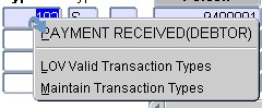
Content Pop-up Menus
Content menus are available on selected fields. The purpose of a
content menu (sub-menu for the item) is to display the description of a
code when applicable; provide access to the list of values if
there is one: and list other available
applications (drill-downs).
If there is a content menu for the item, it is indicated by a blue
arrow
when you move your mouse over the field. Where an option on the pop-up
menu allows you to drill down
to an
application existing on a standard ITS menu, user access select and
update
rules will apply and the user must have access to the option to
view/update
the application. Each option on the pop-up menu has a
short-cut that is
underlined and can be used to select the option (e.g. pressing 'm' in
the example above will take the user to the "Maintain Transaction
Types"
application).
Tooltips
On all mandatory, non-mandatory and query fields tooltips
are
available. Moving the mouse over the field will display the tooltip
for the field. Display only fields will not have tooltips.
List of
Values
To access a list of values on a field in a DSL application you can
click on the LOV button on
the right-hand side of the field or
use the content pop-up menu if available via a right-click on that
field
and select the “LOV ...” option or
invoke the list of value by the keys 'Ctrl + L'.
Content Pop-up Menus
“Drill Downs” in DSL and Graduator
applications are indicated
by way of the Content menu's curved blue arrow . To access a
drill down on a field right
click on the field to invoke the content pop-up menu: from here the
user can
select the option from the menu in order to drill down to a
application.
Drill Downs
The drill down facility in Finance enables the user to access other
relevant
options without exiting from the present option. An example
of this would be if the user wants to link a new creditor to a creditor
type in the menu {FPMM-2}. A creditor type for the new
creditor does not already exist. Next to the field for
“Creditor Type” a small light blue button
represents the
drill down facility. If the user <CLICK> on
this button, the option to create creditor types is
displayed. The creditor type can be created and on exit the
user is back in the original option. The new creditor type
can now be linked to the creditor and the user can continue to create
the record.
Shortcut key : <CLICK> on the light
blue button next to the field.
Navigation
To navigate between fields on a record use the 'tab', 'Enter' key or
the mouse.
To navigate between record use the 'up arrow' and
'down arrow' keys: or the mouse or the Next Record and Previous Record
Icons
on the Toolbar.
To navigate between blocks use 'shift + page up':
'shift + page down' or the Next Block and Previous Block icons on the
Toolbar.
To invoke content menu pop-ups, use a right-click of
the mouse
button on a field.
To execute the content menu option: click with the mouse on the option
or use the key indicated by the underlined character on the option.
The ITS system provides for the need to deal with different processes
at
the same time for an entity (e.g. a student) from a single screen.
These options are to fully service an entity from a single screen.
A default entry point caters for holistic data management with a 360
degree view of the student's life-cycle. The institution can create
"environments", such as the academic structure, registration of a
student, allocation of financial aid to students etc., within this
frame and link options or processes to it. An institution has the
ability to create processes that are specific to its business areas.
Entry Points are also described in the Entry Point Operational Manual.
iComms
A choice of communication method is offered in the iComms
functionality. The user can manipulate correspondence through desktop
integration, send bulk SMSs via iSMS or make use of the iMail
functionality for sending documents via e-mail.
The Integrator System provides the user with the ability to
create and maintain a
letter in a word-processing product and to then use the letter as a
template to communicate to students and other stakeholders.
The documents then goes through an upload procedure into the Integrator
System and is
merged with a specific set of data: final / merged documents are
generated. These merged documents can then be printed directly via PCL,
mailed to the student and / or displayed as a PDF document. The
documents are also stored in the ITS Document Storage and
Retrieval System (DSR).
Refer to the iComms Operational
Manual for more information
This facility provides for secure, interactive, customizable,
push-delivery communication to the mobile- and Internet devices
of the organization's clients and stakeholders. Example
applications are payslip distribution and communication of academic
results and statements to students. This is facilitated
through agreement with third party company Infoslips
and will be marked under iComms - iMails.
Refer to the marketing glossy brochure or contact ITS Holdings for more
information.
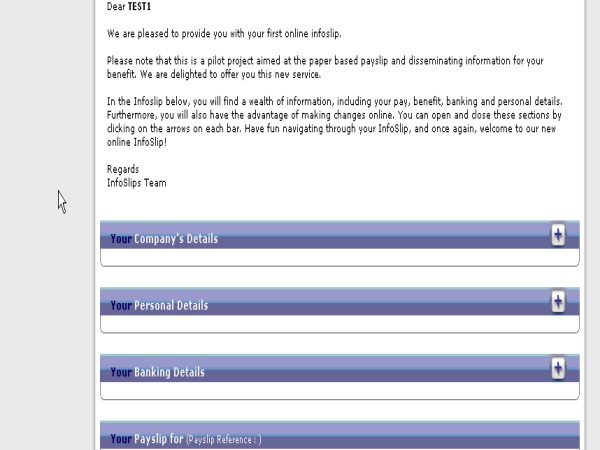
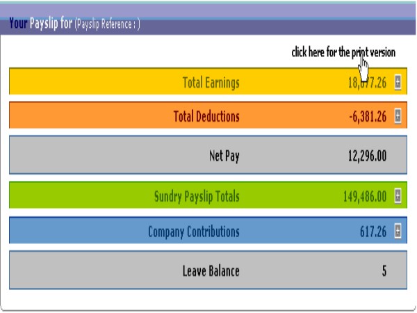
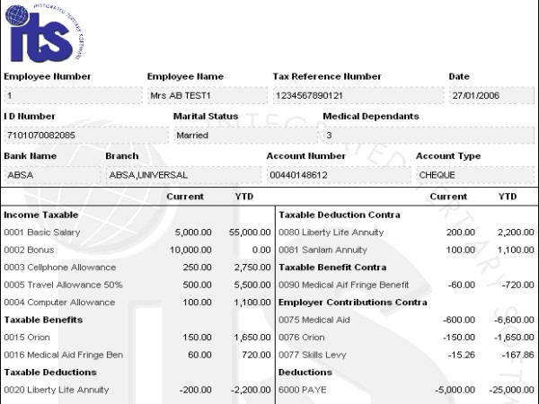
Below is an example payslip distributed through the Infoslips facility.
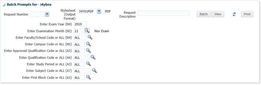
Prompting of
Report Parameters Click Here
The following
has been done to accommodate long parameters:
- The screen has been redesigned to one that is
much larger, thereby allowing for more prompts to be fitted onto the
page.
- All Prompts are now on one large
scrolling display.
- If the user enters a code into a field for
which there is an LOV, the description for that code will be displayed
next to it.
- Fields
that are coloured in blue have a list available
from which to select the input criteria.
Bellow is an example of the new bigger layout.
Reports
One of the main aims of
Integrator was to standardize the output format
to reports. In ITS Integrator 1, several reports in the Student and
Student Debtor System have been changed in order to deliver output in
Adobe
Acrobat PDF format.
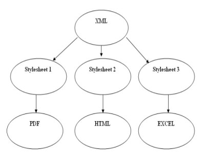
These reports on the ITS System have been converted into XML
format so that XSL stylesheets
can be applied to them. A client can change
the layout of a report himself or contact ITS to do
it, without changing the program that contains the business
logic. ITS has effectively separated data retrieval from data
presentation.
Explanation:
As can be seen from the figure above the business logic (the part that
obtains
the data from the database and applies any processing rules) is
separated from the presentation layer. A user can create different
output
formats by applying different stylesheets to the same XML.
All reports are
generated on-line through batch
processing. This must not be confused with the
running of the reports in immediate or deferred
batch mode. Reports can be re-generated using different
selection criteria without having to revert back to the report
menu. After the reports have been run, the user can scroll
to the selection criteria again, change the criteria and run
the
report again. Use the scroll on the right hand side of the
screen to gain
access to the different parameters of the report.
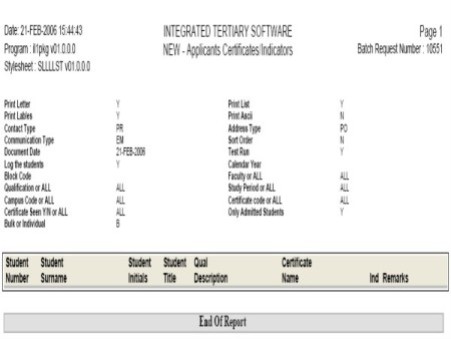
Below is an
example of report output headings.
- The Stylesheet name (and version) and batch request numbers
are shown.
- The parameters are shown in 2 columns on the page to save
space.
- There are blocks around each of the areas in order to
highlight the
information.
- Different formatting has been used for the
different headers and
data.
- The total value per User Code is highlighted in a different
colour than used for the normal text.
- The End of Report can be changed or removed by changing the
stylesheet.
A report can
be saved directly on the PC after it has been run through
the normal Windows functionality. The user can also print the
report to any printer linked to the PC or to a system printer as
defined in Unix.
How to run
a report
•
After the selection criteria
have been completed, the user will be taken to the screen with the run,
batch and exit options.
•
To run the report, the user
should 'click' on the run button or press
<Enter>
once the focus is on the run button.
•
Once the report has completed it will automatically 'view' in a new
window.
•
The user can now follow normal Windows procedures to print or click on
the printer icon on the PDF reader.
List
Function Available on Selection Criteria
In prompting
of report
parameters,
all fields
that are coloured blue have a list available
for selecting the input criteria. This list will
display all the allowed values for this field either as entered by the
institution, or as fixed in the system. The
<list of values> can be reached by: clicking on the
LOV
indicator (three dots) at the end of the field, or by using
the
shortcut key (ctrl + l)
or the menu bar (Edit -> Display List). If the user
knows the
value, it can be typed
in directly.
Immediate or Deferred Batch
A report can
also be run in immediate or deferred batch directly while
requesting a report. For more information on the
functionality of batch, refer to the ITS General Systems Manual.
If a user wants to run
a report in batch, the
“BATCH” button can be selected after the
report’s input criteria has been entered. The
following steps must be followed:
- Select
“Immediate” or “Deferred” and
then select <Next>. Deferred batch jobs only
start once the
batch queues are opened in Open/Close Queues {BATCH-3}.
- If a
printer is
required, select (Yes) and <click> on
“Select a printer”
- The
user’s list of
allowed system linked printers will display and a
selection can be made from these.
- If no
printer is required at
this stage, select (No) and then select <Next>
- If this
request is dependent
on another request, the number can be entered in “Dependant
Request Number”. A list function is also available
in the “Check it” button and then select
<Next>
- The
selection criteria for the
batch job will display and the user can select
“Proceed”
- A pop-up
screen will display
the request number. This number can be used for query
purposes.
The deferred batch jobs
can now
be monitored with the batch functionality
available on the menu. For more information on this, refer to
“Query Batch” in this manual.
Previous Request
Each generated
report
is automatically allocated a unique request
number. If this request number is used again, the selection
criteria for the report, as it was when allocated, will be
recalled. This enables the user to store frequently used
input criteria and takes away the need to type it in every time the
report is run. For consecutive runs the input criteria can be
used as is, as recalled when the request number is entered, or changed
for the new run of the report.
The request number can
be entered in the first prompt of the report in
the field “Previous Request” . A
<list of values> is available on this field and will
display the previous requests made when the same user (currently logged
in) ran
this report.
Dynamic Logfiles provides the institution with the ability to create,
maintain and print logs for any table in the system. It allows the
System Administrator to decide
whether a log of records inserted, updated and / or
deleted from this table will be stored.
Menu Options: {DMAIN-31}
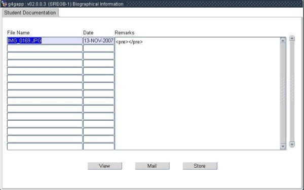
Document Storage
and Retrieval
This system allows the user to Store and Retrieve Electronic
Documents. All types of files can be stored and
retrieved, including Word Documents, Spreadsheets, images etc.
Documents may be associated with transactional- and other records
stored in the Integrator System.
To access or store documents related to a specific record
- Navigate to the application program (screen) that is used
to maintain the record
- Query the record
- Upon Right-Click on the screen canvas, a pop-up menu (see
below will appear)
- Upon selecting "Document Storage and Retrieval", the
Document Storage Dialogue (See below) will appear.
- The Document Storage Dialogue will allow the user
to
- View Documents
- Send Documents by Email
- Store Documents
Refer to Maintain Documents (Logged in User) {
GDOCS-2} for detail on
the above three functions as these functions may also be accessed from there.
Refer to Overview of Document Storage and Retrieval {GSYS-8} for more information.
Addresses
(Existing Format)
Refer to the
Operational Manual for Address
and Communication
History
Of Changes
| Date |
System Version |
By Whom |
Job |
Description |
| 16-May-2006 |
v01.0.0.0 |
Charlene van der Schyff |
t137175
|
Update
Operational Aspects of the ITS system, add new enhancements |
| 16-Jul-2007 |
v01.0.0.0. |
Charlene van der Schyff |
t137175 |
Include Oracle answer to LOV will be found under
options "Buttons" and linked throught manual. |
| 13-Sep-2007 |
v01.0.0.0 |
Charlene van der Schyff |
t137175 |
Insert correct EP screen. Insert worklist email area.
Insert the correct links. |
| 08-Sep-2008 |
v01.0.0.0 |
Charlene van der Schyff |
t152013 |
Edit language obtained from proof read language Juliet
Gillies. |
| 24-Apr-2009 |
v01.0.0.0 |
Charlene van der Schyff |
t158153 |
Added information pertaining to addresses. Third Party
Software |
| 11-Jun-2009 |
v01.0.0.0 |
Charlene van der Schyff |
t158153 |
Removed Address information and inserted link to
address manual. Also
removed the third party software info and referred this to address
info. After proof read (Frans). |
| 17-Jun-2010 |
v01.0.0.1 |
Frans Pelser |
t167681 |
Dynamic Log File Information |
| 26-Jan-2011 |
v02.0.0.0 |
Frans Pelser |
t148123 |
Forms Translation |
| 18-Jul-2011 |
v02.0.0.1 |
Magda van der Westhuizen |
t175247 |
Add link for further information regarding changing of
passwords under logging On image. |
| 15-Oct-2012 |
v03.0.0.0 |
Frans Pelser |
t181818 |
Improve text about DSR |
| 29-Oct-2012 |
v03.0.0.0 |
Dinong Serek |
t181818 |
System owner proof read |
| 01-Jul-2014 |
v03.0.0.1 |
Bertha Kuwane |
t199744 |
Inserted 3 missing EP links |
26-Jan-2017
|
v04.0.0.0
|
Clinton Naidu
|
t210380
|
Proof Read
|
30-Jan-2017
|
v04.1.0.0
|
Frans Pelser
|
t226563
|
Entry Points url to point to the new Integrator 4.1 EP document
|